Branding for Tiki - Japanese & Peruvian Fusion in Japan
We developed the visual identity for Tiki, a restaurant that blends the sophistication of Japanese cuisine with the intensity and tradition of Peruvian gastronomy. Located in Japan, Tiki offers a unique experience where the fusion of flavors stands out both in its dishes and its brand identity.
Brand Concept
Tiki's branding is built on the cultural fusion of two culinary traditions, conveying modernity, elegance, and authenticity. We focused on creating a dynamic, attractive image with a balance between Japanese sobriety and Peruvian warmth.
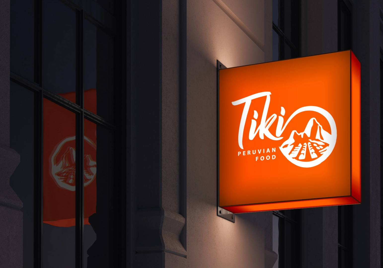
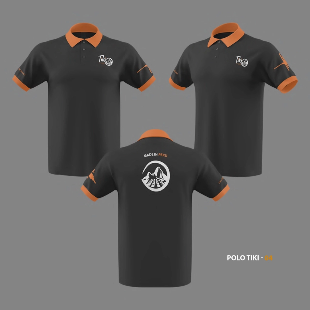
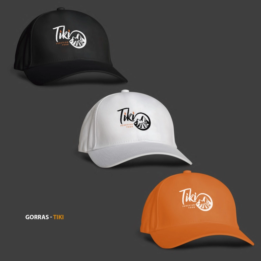
Logo: A handwritten-style font to reflect authenticity and closeness, paired with an icon that integrates Machu Picchu with graphic elements from Japanese culture.
Color Palette:
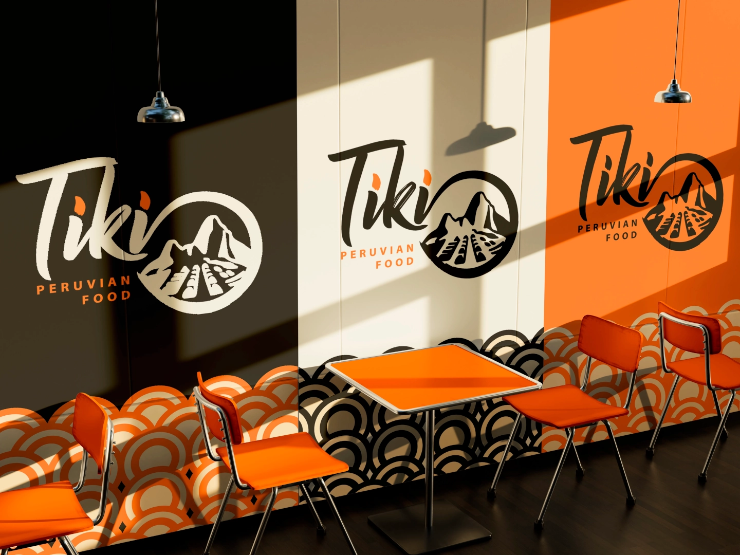
Orange: Energy, warmth, and connection to the tones of Peruvian cuisine.
Black: Sophistication and a nod to Japanese minimalism.
White: Purity and visual balance.
Typography: Modern with organic touches, conveying both tradition and evolution.
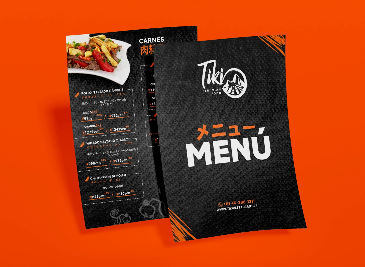
Graphic Patterns: Inspired by Japanese waves and Andean iconography, used in applications such as menus, packaging, and signage.